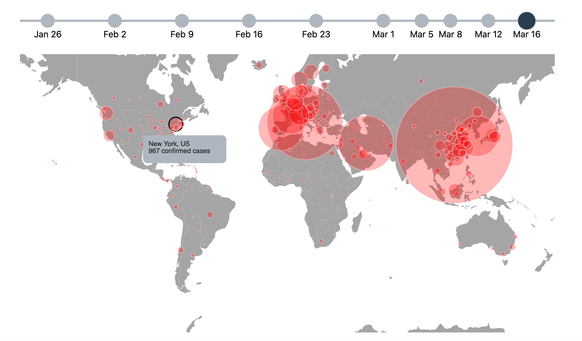
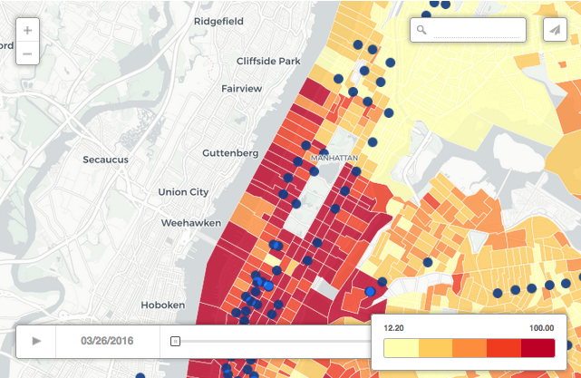
COVID-19 Timeline Map
COVID-19 has completely turned the world as we know it upside down. In tracking this calamity, John Hopkins has put together an amazing dashboard to visualize the spread. They have also been kind enough to share their methodology and data on github. With that, I have worked to create my own visualization of their data so that you can see the progression over time, and not just the current state of affairs. Stay healthy and stay informed!