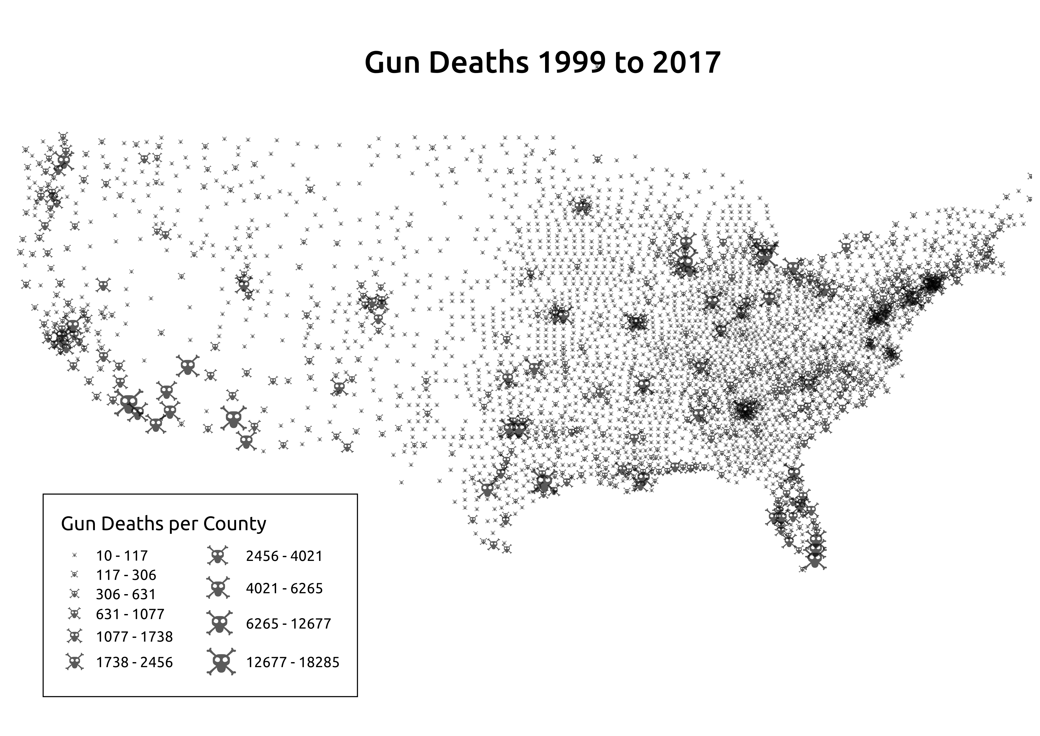
Gun Deaths in America
I created this infographic using data from the Center for Disease control and shapefiles from the US census bereau. I combined these files using QGIS and some python preprocessing. The symbols are proportional to the number of deaths from Gun Violence for the given county from 1999 to 2017. In total this data encompasses just over 610,000 deaths.
